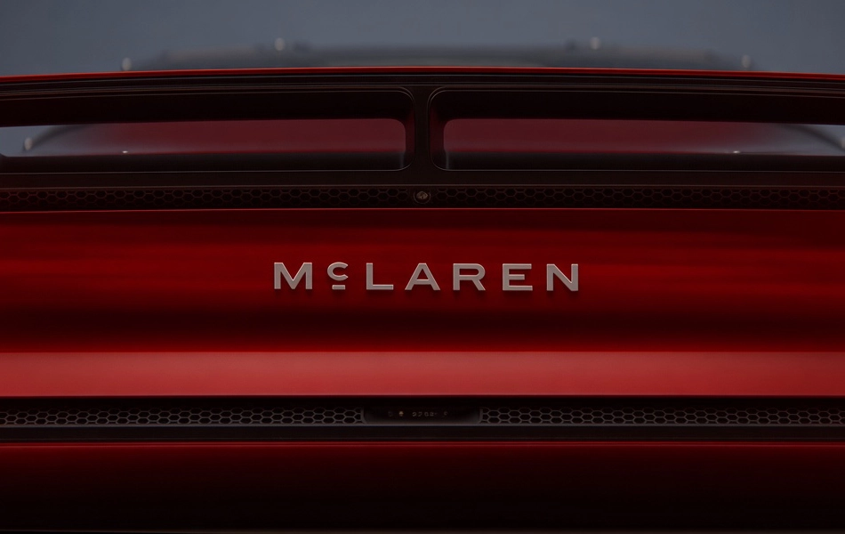
McLaren has unveiled an evolved brand identity designed to connect its racing and road-car businesses while bringing more than 60 years of history into a new chapter.
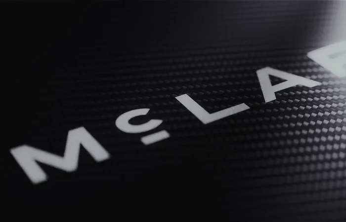
At its heart is a new McLaren wordmark, inspired by the sign that once hung above the McLaren family service station in Remuera, Auckland. It was there that Bruce McLaren built the car that delivered his first racing victory — making the new design a deliberate link back to the company’s origins.
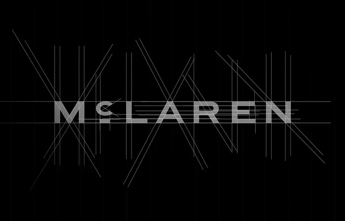
The familiar Speedmark, Papaya colour and Speedy Kiwi all remain, although McLaren is expanding its colour palette with new shades inspired by significant moments in its history.
The wider rebrand is intended to represent more than simply a new logo. McLaren says it wants to build a broader ownership and fan experience, with greater personalisation, new experiences and a stronger sense of community across both McLaren Automotive and McLaren Racing.
The timing is significant. McLaren is simultaneously celebrating major milestones in motorsport, including its 1,000th Formula 1 Grand Prix, while preparing its return to the World Endurance Championship with a new Hypercar programme.
And on the road-car side, McLaren is entering another major phase of expansion. The company has announced a £500 million investment programme in its UK manufacturing and engineering operations, including plans to move beyond its traditional two-seat sports cars with an upcoming SUV.
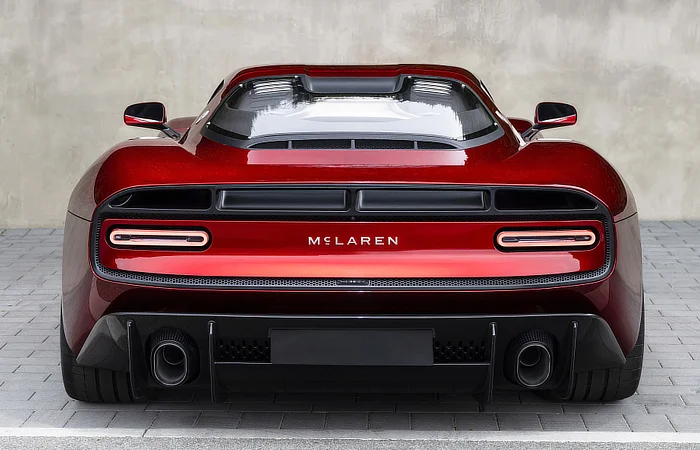
So while McLaren is changing how it looks, the message is that the underlying philosophy remains the same: Bruce McLaren’s restless desire to go faster, innovate and find another way forward.